
Thursday, 8 January 2015

Production: Advertisement


Production: Digipack and Disk Design

I chose to produce a six pane digipack, as this was a trait I noticed when doing my genre research. As well as this, I chose to have the CD contained in a pouch (the top left pane in my design), which was another convention I noted.

Firstly, I cropped my final, edited images and put them in place, over the digipack template I used.

Next, I added semi-transparent boxes where I would be placing smaller text that need to be read easily.

And, finally, I added the text and the detailing (barcode, etc.). Below shows my final digipack products...


Wednesday, 7 January 2015

Production: Fonts

 The main font I have chosen to use in my print work is a sans serif font entitled, 'Century Gothic'. This is a regularly mundane font and would usually be quite dull. However, by writing entirely in upper case and setting specific words to bold, I have made it more interesting. I did this as it was a trait of the print products I researched.


The second font I chose is from the website 'DaFont.com' and if far more complex than my first. And I have chosen to only write the artist's name in this font (as is usually done on digipacks and advertisements in this genre). I have edited this font by adding the same filter to it as I did with my photographs. I will do this to my other typography too.


These fonts were presented to a sample of my target audience, both over the internet (through a site called Movellas) and in person. They were both looked upon well.


Tuesday, 6 January 2015

Production: Editing Photos

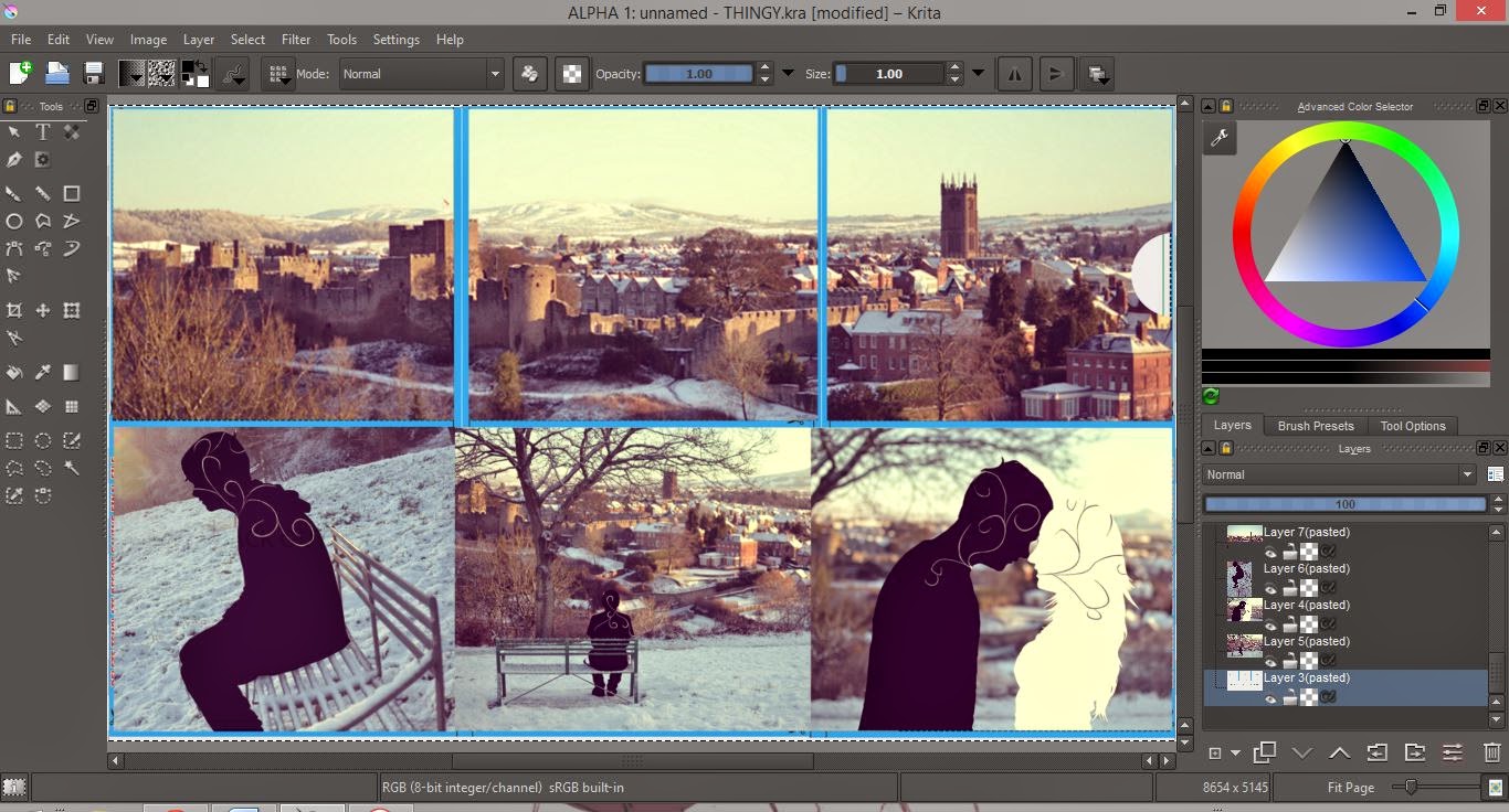
When editing my photos, I planned to create a silhouette effect, then add in a swirled motif, to link back to the tattoo designs in our music video. I also noted from my research that illustration is a key element in the print works of my genre.

To produce this, I firstly created a layer above the photograph, after opening it in Krita. Then, with the top layer's opacity set down, I coloured over the portrait.

Once I had my silhouettes, I selected each one in turn, then added another layer above where I drew the swirled motif. I chose to select the silhouettes this way, as it ensured that the swirls didn't stray out of the silhouette boundaries.

I then repeated this with the other silhouette and neatened it up.

I used a special 'curve' brush to create the swirls. Above shows a zoomed in screenshot of the brushes appearance.

After creating the image, I decided to explore filters using iPiccy. All of which, I reduced the intensity of a little, as they were too strong as the website presented them...


The final filter is my favourite, the one chosen by my audience sample that I asked, and the one I intend to use. I then, finally, edited the other images this way...


Production: Print Products Photoshoot and Planning

Unfortunately, our original actors were unable to spare any time for a photoshoot for my print work. Luckily I planned a way to work around it and hope for this to create overall more attractive products in the end, anyway.
To link my print products to our video, I used the same locations - specifically the setting of the performance sector of our video. As well this, I plan to edit my images in a way that link clearly to the narrative of our video.
On this shoot, the weather was the main issue. Due to the snow, it was very cold and limited the time we had to gather the images. However, overall, the snow really added to the shoot, and I think it works really well!


Thursday, 11 December 2014

Production: Rough Cut Feedback


Due to this feedback, we have been alerted to a few issues with the video and intend to remedy these by reshooting some of the performance pieces.

Production: Rough Cut


Wednesday, 3 December 2014

Planning: Choreography

To ensure our music video looks professional and as attractive as possible to our target audience, we have to study the best way to create relevant choreography of the performance sections of our video.

Most pop punk videos have minimal choreography - usually just the performers bouncing to the beat of the music, or acting out the passion that comes with producing the music. This is relatively natural when lip syncing a passionate song like 'The One'.


Planning: Makeup, Costume, Props and Location

Thursday, 20 November 2014

Production: Day One of Filming

Today was our first day of filming. Today, we filmed all of the performance section and a large proportion of the narrative section. This took us around six hours, starting at 9:00 and finishing up at about 15:30.


Wednesday, 19 November 2014

Planning: Risk Assessment

Potential Danger
Potential Outcomes
Actions to avoid potential outcomes
Leaning over bridge, leading to falling.
Very serious injury.
Keep at a safe distance, do not lean over walls.
Obstructing pedestrians with our equipment.
Others' injuries.
Filming when it’s not very busy in the town.  Someone watching passers by
Standing too close to cliff edge when filming on Whitcliffe.
Very serious injury.
Keep at a safe distance, do not lean over edge.
Working in road, with cars.
Very serious injury.
Road safety, green cross code and staying on the pavement as much as possible.
Dropping camera.
Equipment damage.
Use a camera strap when handheld, or ensure camera is secured to tripod.

Thursday, 23 October 2014

Planning: Makeup Tests

This is a basic sketch that I produced when coming up with ideas for the 'tattoos' that will appear on both actors skin during the video.

'Octane OK' hand tattoo for final shot.


Using eyeliner to draw on motif.


Final motif (part of) for male performer.

 
Final motif (part of) for female performer. Using ink. More delicate.

Planning: Casting

When selecting our actors for both the narrative and performance sections of our video, it was important that we considered our target audience. For example, we felt it was appropriate for our actors to have relatively plain hair colours with no extreme haircuts or hairstyles, as this would be a similar style to that of the audience of the idie/pop punk music scene.