Thursday 8 January 2015

Production: Advertisement


Production: Digipack and Disk Design

I chose to produce a six pane digipack, as this was a trait I noticed when doing my genre research. As well as this, I chose to have the CD contained in a pouch (the top left pane in my design), which was another convention I noted.

Firstly, I cropped my final, edited images and put them in place, over the digipack template I used.

Next, I added semi-transparent boxes where I would be placing smaller text that need to be read easily.

And, finally, I added the text and the detailing (barcode, etc.). Below shows my final digipack products...


Wednesday 7 January 2015

Production: Fonts

 The main font I have chosen to use in my print work is a sans serif font entitled, 'Century Gothic'. This is a regularly mundane font and would usually be quite dull. However, by writing entirely in upper case and setting specific words to bold, I have made it more interesting. I did this as it was a trait of the print products I researched.


The second font I chose is from the website 'DaFont.com' and if far more complex than my first. And I have chosen to only write the artist's name in this font (as is usually done on digipacks and advertisements in this genre). I have edited this font by adding the same filter to it as I did with my photographs. I will do this to my other typography too.


These fonts were presented to a sample of my target audience, both over the internet (through a site called Movellas) and in person. They were both looked upon well.


Tuesday 6 January 2015

Production: Editing Photos

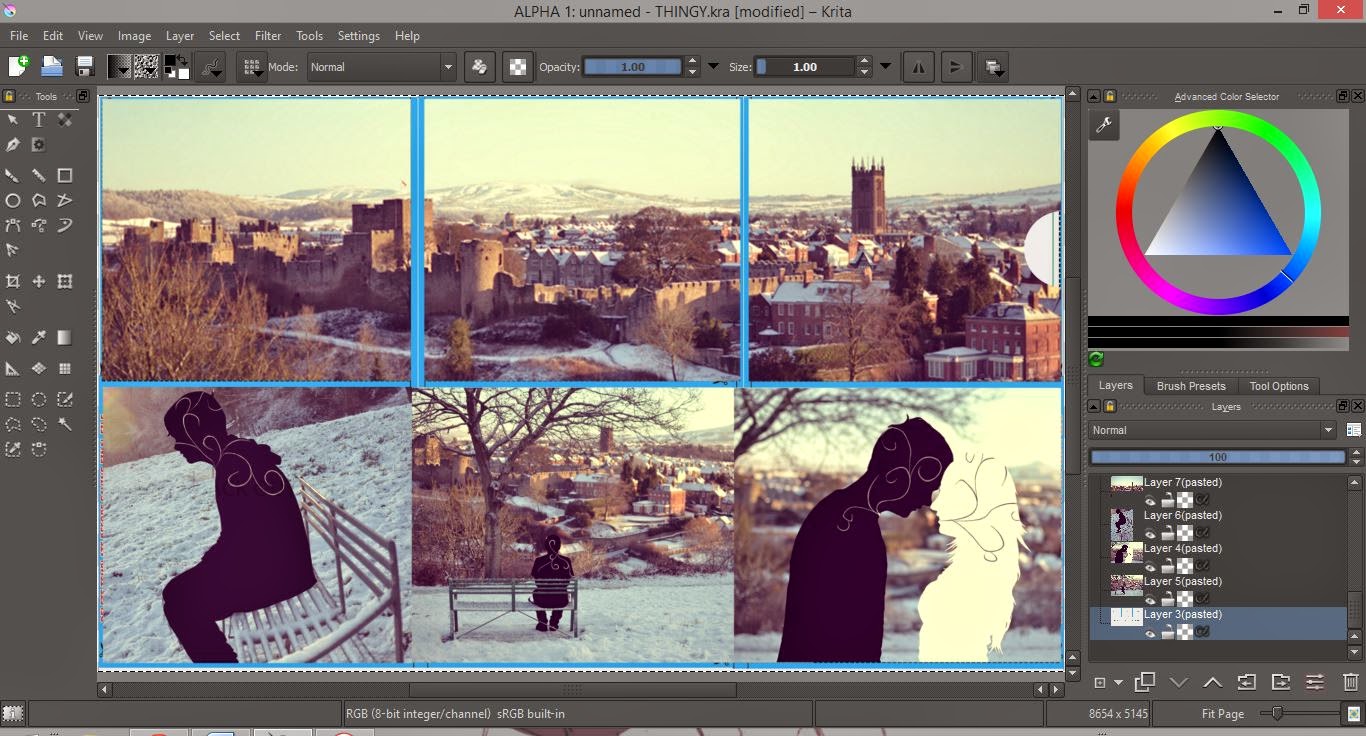
When editing my photos, I planned to create a silhouette effect, then add in a swirled motif, to link back to the tattoo designs in our music video. I also noted from my research that illustration is a key element in the print works of my genre.

To produce this, I firstly created a layer above the photograph, after opening it in Krita. Then, with the top layer's opacity set down, I coloured over the portrait.

Once I had my silhouettes, I selected each one in turn, then added another layer above where I drew the swirled motif. I chose to select the silhouettes this way, as it ensured that the swirls didn't stray out of the silhouette boundaries.

I then repeated this with the other silhouette and neatened it up.

I used a special 'curve' brush to create the swirls. Above shows a zoomed in screenshot of the brushes appearance.

After creating the image, I decided to explore filters using iPiccy. All of which, I reduced the intensity of a little, as they were too strong as the website presented them...


The final filter is my favourite, the one chosen by my audience sample that I asked, and the one I intend to use. I then, finally, edited the other images this way...


Production: Print Products Photoshoot and Planning

Unfortunately, our original actors were unable to spare any time for a photoshoot for my print work. Luckily I planned a way to work around it and hope for this to create overall more attractive products in the end, anyway.
To link my print products to our video, I used the same locations - specifically the setting of the performance sector of our video. As well this, I plan to edit my images in a way that link clearly to the narrative of our video.
On this shoot, the weather was the main issue. Due to the snow, it was very cold and limited the time we had to gather the images. However, overall, the snow really added to the shoot, and I think it works really well!